The Free-Viewing Stereograph: Each Hand Holds History
July 15, 2026
Written by Morgan Strong
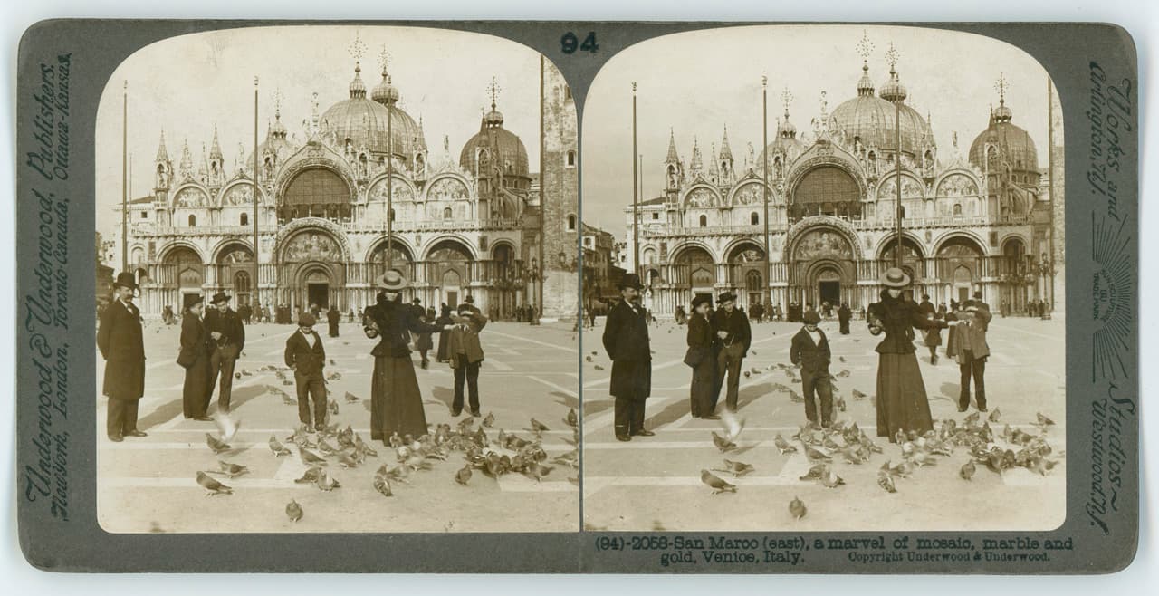
Outside of St. Mark’s basilica, a crowd gathers around a woman surrounded by a flock of pigeons. She opens her palms to the sky to invite their company. A skeptical boy behind her watches a pigeon flap its wings to perch on one of her hands, followed by another on the other. In the pursuit to document the church in the background, the photographer captures this uncanny interaction, reflecting life in the city. The image was published as a stereograph, a double image which, when viewed through the proper instrument, merges to form one three dimensional image, immersing the viewer in the scene. (Fig. 1)
I joined the Crocker Museum as a Curatorial Intern in the spring of 2026, while completing my Museum Studies minor at UC Davis. I was tasked to inventory over 1800 stereographs, donated by one man, Steve Schmidt, who spent over 25 years collecting these images.
In his collection were a series of images of St. Mark’s basilica. Each image captures the church’s monumentality, accentuated by the piazza, or public square, leading to the church. Despite the grandeur, it all faded away when I saw the pigeons. Each image consistently featured an entire flock, often showing more pigeons than people on the piazza. Maybe she’s sending each off with a message home (Fig. 1).
Stereographs were described as “travel not for the body, but for the mind” (VanderKnyff), a sentiment used in 20th century catalogues to instill a sense of worldliness in the viewer. The cards themselves have traveled from owner to owner and encode their own worldliness through notations. Beyond the depicted landmarks or events on the front, the markings and notations on the back truly tell the story. Depending on the publisher, the front may have a title, number, publisher name, and a printed description. The variation on the back is striking. Sometimes the purchase price is quickly penciled in with a “10-” in the corner, or a crooked, green “Public Library. Dayton, Ohio" is stamped in the middle. Some have handwritten notes from various collectors over the decades, scribbled on the back. Sometimes it’s a blank canvas with some sun spots and stains. Each card is a unique reflection of the place it represents but also the hands that have held it. After the stereograph is printed, its life truly begins.
What is a stereograph and what was its role in 19th century society?
The example above is a stereograph card, or a stereoview (Fig. 1). When viewed through a stereoscope, the two images merge to create a three dimensional image, placing the viewer in the scene.
“The poor man’s gallery” (Pellerin, 9), coined before the invention of the stereoscope itself, was termed to describe media, like stereographs or prints, that affordably replicated paintings, depicted far away places, or served as publicity for an event or company or personal use. The stereograph was introduced commercially in 1854, though it was a photography technique used before (Darrah, Stereo Views 14). By the late 19th century, the middle class became the primary market, with individuals collecting stereographs of places they had visited or places they would only see through the stereoscope. Looking at stereographs was akin to going to the movies or flipping through a photobook. (The Library of Congress).
Publishers
By the mid 1860s, amateurs and publishing firms were selling their stereoviews by mail order, with door-to-door salesmen, and in stores (The Library of Congress). Most of the stereograph industry was conducted by a few main publishers, who employed photographers to take negatives or purchased negatives from other sources. The main publishers would print them themselves or contract the printing. Photographers are often not cited on the stereographs because major companies purchased negatives and contracted many photographs.
Often a single negative would be bought and sold multiple times, creating identicals across publishers. Stereographs were often sold in box sets, released along different themes by individual publishers. That way, collectors could expand their view of the world through curated sets of stereoviews.
The Collector’s Collection
There are four main types of collections: general, topical, geographic, photographers. A robust general collection could be in the hundreds to thousands and cover all topics without a focus. Topical collections could focus on subjects ranging from the Civil War to cats. Geographic collections focus on a single village, city, state, region, or country. Some small towns – like Keene, New Hampshire – are highly documented due to a singular, enthusiastic photographer, and remarkably, some major cities – like Detroit – have very little coverage. (Darrah, Stereo Views 126).
The collection of Steve Schmidt includes landscapes and architectural scenes, world expositions, the aftermath of disasters, portraits of families and prominent figures, and advertisements.
The collection includes twenty-four images of the 1889 Johnstown flood from five different publishers. The images document history, but the titles embellish the scope of devastation as the story is revealed: “Looking down Main street from the corner of Clinton, showing where some of the finest stores in the city stood,” “From the rear of the P.R.R. depot looking toward the Stone Bridge, where so many people were burned to death. In the distance can be seen the smoke rising from the fire. To the left is the Millville school house, the only building remaining in the lower part of the city and which was used as a morgue,” and “Famous dog ‘Romey’ that saved three lives. After they had fallen from the house top the dog pulled them to floating logs and saved them” (Great Johnstown Flood, May 31, 1889, Published by R. K. Bonine).
Each stereoview is a curated view through the eyes of the photographer and a reflection of a momentary or long-term cultural focus. Someone – photographer, publisher, collector – decided that what is shown was important to document, publish, collect, buy, etc. Each owner adds their perspective adding their own markings in the context of a collection.
Markings
The most common markings are text printed by the publisher, handwritten notes, stamps in ink, adhered stickers, and embossed notations. These markings include inventory numbers, price listings, descriptions and titles, names of publishers or institutions. Each publisher has their own style, but formatting changed over time as technology developed. Each stereograph reflects an intentional, temporal standard.
While recording the stereographs in the Crocker's collection, I was particularly taken by the handwritten descriptions in script on the backs of these stereographs. I found three examples that encapsulate the beauty and power of the stereograph, displayed through the inscriptions and stories written on the back.
The Story is Written on the Back
The images below show the fronts and backs of stereocards, followed by a transcription. (Figs. 2-7) Progressively, the interpretations of the scene become more personal, as the image gains a new life outside of the artist’s lens, the publisher’s vision, or the vendor’s pitch.
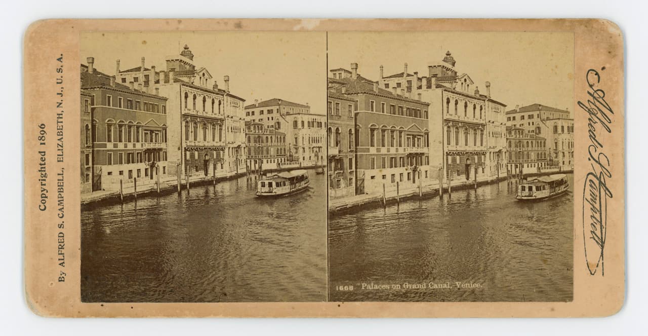
Example 1: Palaces on Grand Canal, Venice
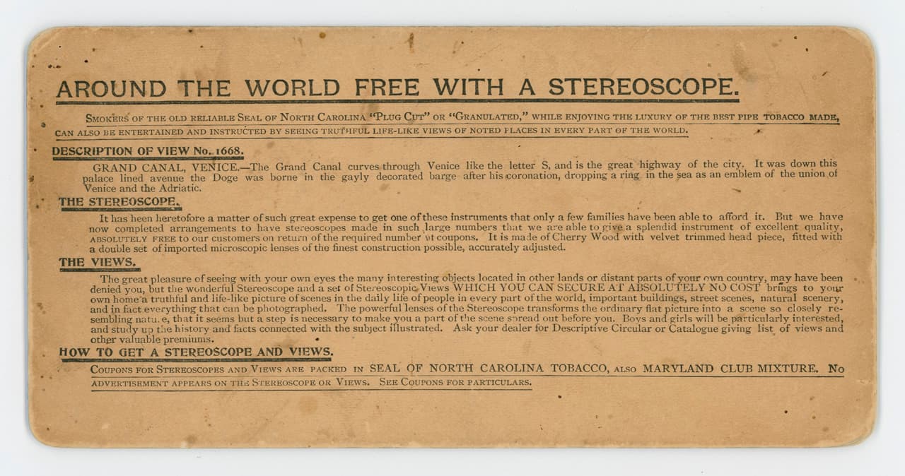
Transcription
“AROUND THE WORLD FREE WITH A STEREOSCOPE.
Smokers of the old reliable Seal of North Carolina "Plug Cut" or "Granulated," while enjoying the luxury of the best pipe tobacco made, can also be entertained and instructed by seeing truthful life-like views of noted places in every part of the world.
DESCRIPTION OF VIEW No. 1668.
Grand Canal, Venice.—The Grand Canal curves through Venice like the letter S, and is the great highway of the city. It was down this palace lined avenue the Doge was borne in the gayly decorated barge after his coronation, dropping a ring in the sea as an emblem of the union of Venice and the Adriatic.
THE STEREOSCOPE.
It has been heretofore a matter of such great expense to get one of these instruments that only a few families have been able to afford it. But we have now completed arrangements to have stereoscopes made in such large numbers that we are able to give a splendid instrument of excellent quality, ABSOLUTELY FREE to our customers on return of the required number of coupons. It is made of Cherry Wood with velvet trimmed head piece, fitted with a double set of imported microscopic lenses of the finest construction possible, accurately adjusted.
THE VIEWS.
The great pleasure of seeing with your own eyes the many interesting objects located in other lands or distant parts of your own country, may have been denied you, but the wonderful Stereoscope and a set of Stereoscopic Views WHICH YOU CAN SECURE AT ABSOLUTELY NO COST brings to your own home a truthful and life-like picture of scenes in the daily life of people in every part of the world, important buildings, street scenes, natural scenery, and in fact everything that can be photographed. The powerful lenses of the Stereoscope transforms the ordinary flat picture into a scene so closely resembling nature, that it seems but a step is necessary to make you a part of the scene spread out before you. Boys and girls will be particularly interested, and study up the history and facts connected with the subject illustrated. Ask your dealer for Descriptive Circular or Catalogue giving list of views and other valuable premiums.
HOW TO GET A STEREOSCOPE AND VIEWS.
Coupons for Stereoscopes and Views are packed in Seal of North Carolina Tobacco, also Maryland Club Mixture. No advertisement appears on the Stereoscope or Views. See Coupons for particulars.”
Context and Interpretation
There was a yearly ceremony between the 8th century and the fall of the Napoleonic empire called the Marriage of the Sea, or Sposalizio del Mare in Italian, wherein the doge, or supreme leader of Venice, would symbolically claim the territory by dropping a ring in the Adriatic sea. Since 1967, the ceremony has been upheld by the mayor of Venice, replacing the role of the doge.
Alfred S was an English photographer with a publishing company based in New Jersey. The publisher chose to include a brief paragraph on the back before diving into the broader marketing scheme and developments of the stereoscope. As advertised, this technology was becoming more accessible. Companies would often advertise free stereoscopes, accompanying them with the purchase of a set of views or another sponsored item. “It’s just like being there,” describing the wonders of viewing a stereograph from an ad by the American Cereal Co (Wing).
By the mid 1860s, at least twenty distinct publishers were producing over two thousand stereographs every day (Darrah, The World of Stereographs 45). This number increased with the invention of mechanical photoduplication techniques in 1892. Across the world, there were unique patents on different designs of stereoscopes by publishers, and as popularity grew, more publishers saw the benefit of designing their own and marketing them to the public, often with satisfaction guaranteed.
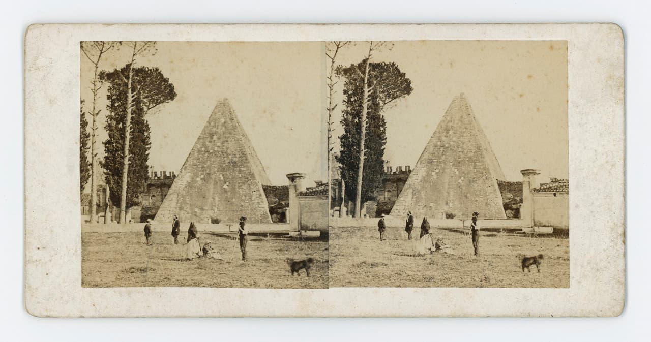
Example 2: Piramid [sic] of Cajus Gestius
Transcription
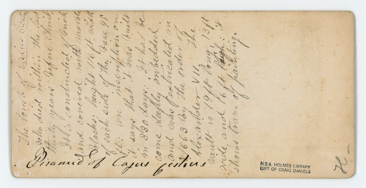
"The tomb of Cajus Gestius who died within the last thirty years before Christ. It is constructed of brick and covered with marble blocks; height 116ft, width of each side of the base 98ft; an inscription on it says that it was built in 830 days; it had be-come deeply imbedded and was extricated in 1663 by the order of Alexander VII. The vault is 19ft long, 13ft wide, and 16ft high: it shows traces of painting.
H-
Piramid of Cajus gestius N.S.A HOLMES LIBRARY
GIFT OF CRAIG DANIELS"
Context and Interpretation
On the front side are two faded images of a pyramid, dotted with foxing around the edges and framed by the white of the paper. On the back, there are no notes from the publisher, no printed labels – only handwritten script and a stamped label to inform the viewer and trace provenance. Every piece of writing was written with different ink, indicating the passage of time. The loopy curves of the penciled H- contrast the calligraphic precision of the written title. The bold ink of the title reinforces the delicate, slanted description above it.
I’d like to imagine that each set of marks reflects a new owner. I wonder in what order these additions occurred. I wonder if Craig Daniels wrote the description on the back before gifting his collection to the N.S.A Holmes Library. I wonder if he ever gets confused with Daniel Craig at the airport.
What I do know is each addition reflects change over time. Each distinct set of writing – the H-, the title, the description – communicates the personality of the writer through ink. Standards in handwriting reflect changes in cultural communication expectations. Cursive has fallen out of curriculum. Images and text exist online, through a screen, and printed versions are temporary copies rather than the ideal final product. The importance of mark making and developing a personal style has waned as information has become digital and communication speed has become paramount.
Example 3: Bridge of Sighs
Transcription
"87
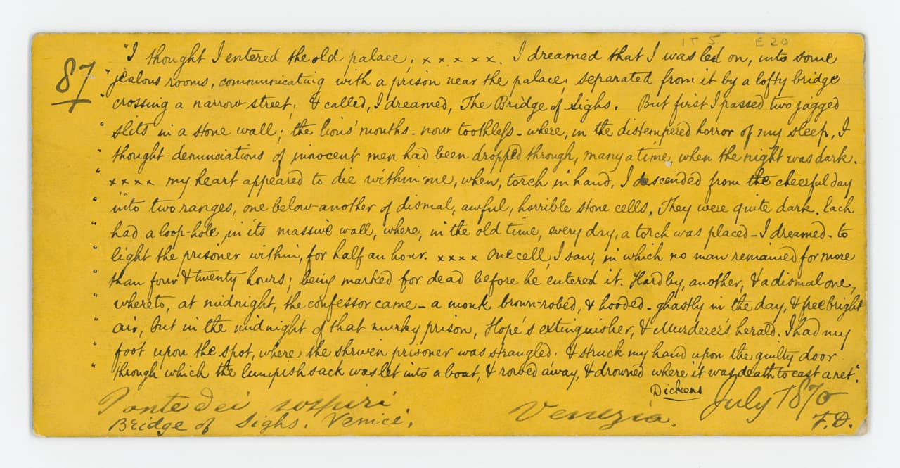
‘I thought I entered the old palace; x x x x x. I dreamed that I was led on, into some jealous rooms, communicating with a prison near the palace; separated from it by a lofty bridge crossing a narrow street; I called, I dreamed, The Bridge of Sighs. But first I passed two jagged slits in a stone wall; the lions' mouths, now toothless - where, in the distempered horror of my sleep, I thought denunciations of innocent men had been dropped through, many a time, when the night was dark. x x x x my heart appeared to die within me, when, torch in hand, I descended from the cheerful day into two ranges, one below - another of dismal, awful, horrible stone cells. They were quite dark. Each had a loop-hole in its massive wall, where, in the old time, every day, a torch was placed. I dreamed to light the prisoner within, for half an hour. x x x x One cell, I saw, in which no man remained for more than four & twenty hours; being marked for dead before he entered it. Hard by, another, & a dismal one, whereto, at midnight, the confessor came - a monk brown-robed, & hooded - ghastly in the day, & freebright air, but in the midnight of that murky prison, Hope's extinguisher, & murderer's herald. I had my foot upon the spot, where the shriven prisoner was strangled. & struck my hand upon the guilty door through which the lumpish sack was let into a boat, & rowed away, & drowned where it was death to cast a net.’
Dickens
Ponte dei sospiri July 1870
Bridge of Sighs. Venice. Venezia. T.B.”
Context and Interpretation
When I first laid eyes on this stereograph, I was absolutely floored by the script: the even line weight, the thoughtful indentation and use of quotations, the precise exes, the perfectly looped letters, the swooping canopies of the dees.
Growing up, my grandmother taught me handwriting exercises to practice the precision of repeated letters. In organized lines, I would write the cursive letter a over and over again, connected and equidistant. After a couple dozen lines, I would rotate the page and continue the linked a’s in another set of lines perpendicular to the first, creating a grid. From there, I would add in diagonal sets of a’s to complete the lattice. Once finished, it looks like a chicken wire fence covered in vines. My grandmother told me in Catholic school if her letters were not of consistent spacing and height, she would be smacked in the hand with a ruler. And now, I do these exercises to practice my penmanship without fear and without company.
Like a dream, the writing can be hard to follow logically, but nonetheless, an unsettling yet nostalgic feeling is conveyed. Similar to the broader role of the stereograph, this writing transports the reader and deepens the connection to the Bridge of Sighs.
From my untrained eye, it’s hard to tell whether the title and date were written before or after the recounted dream. It’s undoubtedly done by a different hand, which is obvious when comparing individual letters like the dees, the tilt of the writing, connections between letters, or overall style. The pen ink is different as well: not just the color of ink but also the thinness and how the ink pools in certain spots within the word.
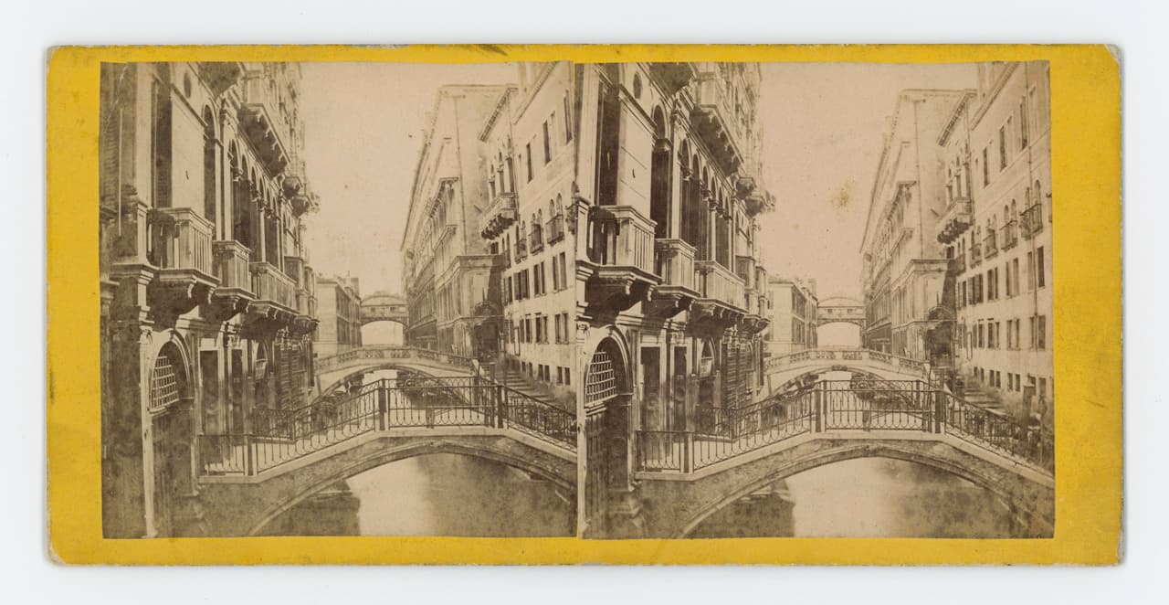
The excerpt is signed “Dickens,” and is taken, though not word for word, from a story from the “Pictures of Italy,” a travelogue from Dickens. The story starts with an ambling dream and description of St. Mark’s cathedral, the same cathedral that is shown on the top of this blog post. On a year-long sabbatical in 1844 with his family, Dickens visited the places frequented by travellers, one of them being the Bridge of Sighs. At some point later, the owner of this stereograph connected them back to each other, rooting the story of the dream to the location it referenced.
Dickens’s sabbatical mimicked the well-established tradition of the Grand Tour. The Grand Tour was a very popular years-long trip for wealthy men in their early twenties, focused on cultural education of Latin and Greek origins, traditionally a tour of Italian and French cities, their museums, major sites, and social events. Dickens is playing along with this history and filtering the experience through his writing. The stereograph industry is similarly engaging with the popular Grand Tour tradition and using this media to create a more accessible experience for those with less wealth. Knowingly or not, the owner of this stereograph is bolstering this connection further, adding a personal layer to the shared cultural imagination.
The beauty of these cards accrues over time. These stereographs have been beautifully preserved by each owner since their production in the 19th century. Their individualized backs reflect the unique value each held to the owner. Many are blank, which too reflects the respect people have towards these objects. Stereographs have largely been omitted from the history of photography, despite being an essential part of 19th and 20th century media consumption. These stereographs were a form of escapism, “travel not for the body, but for the mind,” and still, they hold the same weight as I hold each in my hand, wondering where they have been since the original image was taken.
Sources List
Darrah, William Culp. Stereo Views: A History of Stereographs in America and Their Collection. Times and News Publishing Co, 1964.
Darrah, William Culp. The World Of Stereographs. 1977.
Dickens, Charles, et al. Pictures from Italy. Illustrated by Samuel Palmer, Bradbury & Evans, Whitefriars Press, London, 1846.
Eschner, Kat. “Venice Has Been Married to the Sea for over a Thousand Years.” Smithsonian.Com, Smithsonian Institution, 26 May 2017, www.smithsonianmag.com/smart-news/venice-has-been-married-sea-over-thousand-years-180963370/.
The Library of Congress. “The Stereograph Format.” USA.gov, www.loc.gov/static/collections/stereograph-cards/about-this-collection/overview.html
Pellerin, Denis, Brian May. The Poor Man’s Picture Gallery Stereoscopy versus paintings in the Victorian era. The London Stereoscopic Company, 2014
VanderKnyff, Rick. “Parlor Illusions: Stereoscopic Views of Sub-Saharan Africa.” African Arts, vol. 40, no. 3, 2007, pp. 50–63. JSTOR, http://www.jstor.org/stable/20447843.
Wales, Katie. The Role of Analogy in Charles Dickens’ Pictures from Italy, Poetics and Linguistics Association, www.pala.ac.uk/uploads/2/5/1/0/25105678/wales2010.pdf. Accessed 10 June 2026.
Wing, Paul. Stereoscopes: The First One Hundred Years. Transition Publishing, 1996
A note about the use of AI: Claude AI was used in order to check transcriptions that were done manually by Morgan Strong. Each edit was checked with the original stereograph to confirm its validity before being implemented.